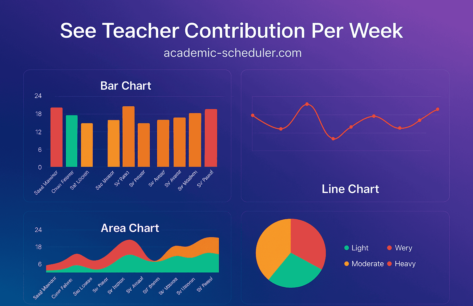
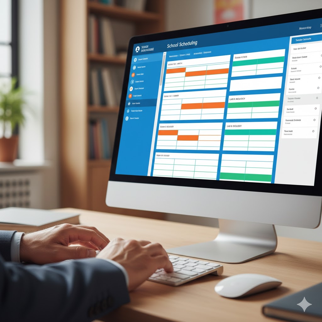
Academic Scheduler’s new dashboard shows weekly teacher contributions in Bar, Line, Area & Pie charts — giving admins clear, visual insights into workload balance.
See Teacher Contribution Per Week — Visualize Teacher Workload at a Glance
Academic-Scheduler.com now includes a powerful dashboard panel that makes it effortless to review teacher contributions across a week. The feature presents data in four complementary visualizations — Bar, Line, Area, and Pie charts — so school admins and coordinators can quickly understand workload distribution and identify needs for rebalancing or substitutions.
Why this feature matters
Managing teacher workload is critical to delivering consistent, high-quality education. When one teacher is overloaded while others are underutilized, classes, student outcomes, and staff wellbeing suffer. The new "See Teacher Contribution Per Week" view helps you:
- Spot workload imbalances at a glance using the bar chart’s side-by-side comparison.
- Monitor trends across days with the line chart to check for recurring peaks.
- Compare contribution mix with the area chart to see how different contribution levels stack over time.
- Quickly summarize distribution using the pie chart for an immediate top-level view.
Feature highlights
- Four synchronized views — bar, line, area, and pie charts all update to the same underlying dataset for consistent context.
- Clear, readable labels — teacher names and chart legends are large and high-contrast for easy reading in article images or dashboard screens.
- Color-coded contribution tiers — Light, Moderate, Heavy, Very Heavy — to simplify interpretation and filtering.
- Export & share — export snapshots as PNG for reports or share a dashboard link with staff.
- Responsive layout — looks great on desktop and is optimized for blog cover imagery with a polished gradient background (purple → blue → purple).
How schools can use this
- Weekly planning: run this on Monday to confirm even lesson distribution and plan substitutes where needed.
- Monthly review: export the charts to include in staff meetings or reporting.
- Staff wellbeing: proactively reassign classes where teachers consistently show “Very Heavy” contribution loads.
Design & accessibility notes
The demo image uses a gradient purple-to-blue background and larger typography so the chart labels and teacher names are crystal clear in blog posts and social previews. Colors are chosen to be distinguishable for color-blind users; we recommend pairing color cues with small icons or textual labels for maximum accessibility.
Call to action
Try it now on academic-scheduler.com — open the Dashboard and click “See Teacher Contribution Per Week” to explore your school’s weekly workloads. If you'd like a custom report format or automated weekly export for your staff meetings, contact our support team.


